How can you efficiently navigate the wealth of data available in your organization? How can you transform this data into visually appealing, interactive summaries that can inform strategic decisions? The answer lies in the use of a SharePoint Dashboard.
A SharePoint Dashboard is a customizable interface within Microsoft’s SharePoint platform that integrates with your existing Microsoft Office applications. Designed to function as a central repository for document management and storage, SharePoint’s capabilities are not limited to these functions. SharePoint can provide a powerful way to visualize and interpret your business data.
In this guide, we will walk you through creating and customizing your own SharePoint Dashboard. The guide has been structured to accommodate both newcomers and experienced users of SharePoint. Whether starting from scratch or looking to refine an existing dashboard, this guide can provide the technical expertise necessary to navigate the platform effectively.
What is a SharePoint Dashboard?
A SharePoint Dashboard is an interactive visual interface in Microsoft’s SharePoint platform explicitly designed for you. It integrates seamlessly with your Microsoft Office applications and is a central hub for your organization’s data.
With this dashboard, you can access, analyze, and display business information from various sources, making it easier to make informed decisions. It’s customizable, allowing you to highlight specific aspects of your data and track key metrics important to your operations.
Using a SharePoint Dashboard, you can turn raw data into meaningful insights, providing a comprehensive view of your organization’s performance at a glance. It’s a powerful tool designed to enhance your ability to monitor and control your business effectively.
Why Use a SharePoint Dashboard?
A SharePoint Dashboard offers a comprehensive, customizable view of your organization’s data. It allows you to seamlessly integrate information from different sources, creating a central data hub. The interactive interface lets you track vital metrics, helping your decision-making process.
With a SharePoint Dashboard, you can transform raw data into actionable insights, making monitoring your organization’s performance easier. By highlighting specific aspects of your data, you can focus on critical areas, improving operational efficiency.
The customizable nature of the dashboard means it can evolve with your changing business needs, ensuring that it continues to provide relevant and valuable insights for you and your organization.
Setting Up Your SharePoint Dashboard
Setting up your SharePoint Dashboard is the initial step towards harnessing the power of data in your organization. This process involves creating an interactive interface to collate, display, and manage your data. This guide will provide the necessary steps to establish a customized, efficient, and user-friendly SharePoint Dashboard.
Step 1: Create a Document Library
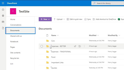
Creating a document library in SharePoint is foundational for setting up your SharePoint Dashboard. A document library is a location on a site where you can create, collect, update, and manage files with team members.
The following are the steps to create a document library:
- From your SharePoint site, click on the gear icon at the top right corner and select ‘Add an app.’
- In the ‘Your Apps’ page, select ‘Document Library.’
- Provide a name for your new document library and click ‘Create.’
Step 2: Choose Your Chart Types and Visualization Software
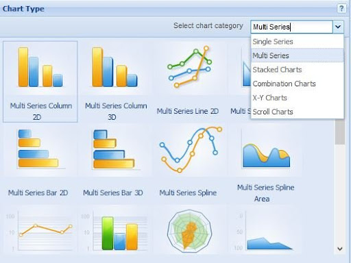
Having established a document library, the next phase involves determining the appropriate chart types for data representation and selecting suitable visualization software.
To choose a chart type:
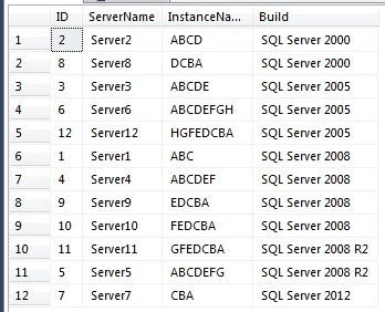
- Analyze the data you have in your document library and determine the most effective way to display it. This may be a bar chart for categorical data, a line chart for trend data, or a pie chart for proportional data.
Choosing visualization software is another crucial aspect. While SharePoint provides basic charting capabilities, you may integrate more advanced visualization tools like Power BI for greater data exploration and interactivity capabilities.
To choose a visualization software:
- Evaluate your data visualization needs, and if SharePoint’s in-built charting capabilities are insufficient, consider incorporating additional software like Power BI.
Step 3: Select Key Performance Indicators (KPIs)
Selecting relevant Key Performance Indicators (KPIs) is integral to creating an effective SharePoint Dashboard. KPIs are measurable values demonstrating how effectively your organization achieves critical business objectives.
To select KPIs, perform the following steps:
- Identify your business objectives: The first step in defining your KPIs involves a clear understanding of your organization’s business objectives. These objectives should be Specific, Measurable, Achievable, Relevant, and Time-bound (SMART).
- Determine critical success factors: Once you have identified your objectives, determine the factors crucial for achieving these objectives. These critical success factors will form the basis of your KPIs.
Define measurable outcomes: For each critical success factor, define a measurable outcome. This measurable outcome will be your KPI.
Step 4: Choose the Right Charting Solution for You
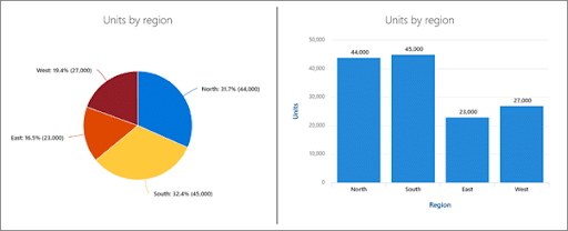
After selecting your KPIs and visualization software, the next step is choosing a suitable charting solution that aligns with your needs. The charting solution will aid in creating data visualizations on your SharePoint Dashboard.
- Review your data and identify the level of complexity involved: This will help you understand whether you need a simple charting solution or a more advanced one.
- Determine the type of data visualizations needed: Different charting solutions offer different visualization options. For example, choose a solution that offers map-based visualizations if you need to visualize data in a geospatial context.
- Consider customization needs: If you require a high degree of customization in your charts, choose a solution that offers flexibility in chart design and formatting.
Step 5: Utilize Pivot Tables and Hybrid Architecture to Enhance Data Analysis
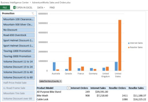
Pivot tables and hybrid architectures represent advanced methods for refining and improving the data analysis capabilities of your SharePoint Dashboard. Pivot tables allow you to summarize, analyze, explore, and present a large amount of data.
To use pivot tables:
- Determine the fields for your pivot table: Decide on the data fields you wish to include in your pivot table. These fields should be relevant to the analysis you wish to conduct.
- Configure the pivot table: Using the chosen fields, configure your pivot table in the data source or directly in your visualization software.
On the other hand, hybrid architectures refer to a combination of cloud and on-premises data sources. This structure allows for more flexible data management and scalability of your SharePoint Dashboard.
To use hybrid architectures:
- Identify your data sources: Determine which ones will reside in the cloud and remain on-premises.
- Implement data integration: Establish connections between your cloud and on-premises data sources, ensuring seamless data flow and synchronization.
Customizing Your SharePoint Dashboard
Customizing your SharePoint Dashboard lets you personalize its appearance, functionality, and content according to your preferences and requirements.
In this section, you will be guided through customizing your dashboard, empowering you to create a unique and tailored experience that optimizes your productivity and meets your organizational goals.
Using Pre-Built Dashboard Examples
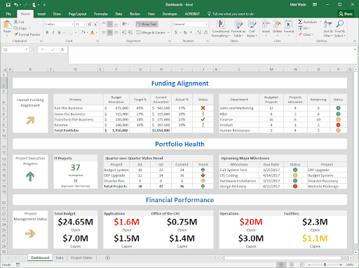
SharePoint provides a variety of pre-built dashboard templates that you can use as a starting point for creating your dashboard. These templates come with predefined layouts and configurations, saving time and effort.
Here’s how you can use these pre-built examples:
- Navigate to the SharePoint Store: Click on your SharePoint site’s ‘Site Contents’ option, then click ‘Add an app.’ On the next screen, select the ‘SharePoint Store’ option on the left-hand side.
- Search for Dashboard Templates: Use the search bar in the SharePoint Store to look for dashboard templates. You’ll find various options, including project management dashboards, sales dashboards, and more.
- Choose a Template: Browse through the options, read the descriptions, and select a template that meets your needs. Click the ‘Add It’ button to add it to your site.
- Customize the Template: Once you have added the template to your site, you can customize it. This may involve adding or removing web parts, changing the layout, and configuring the data sources.
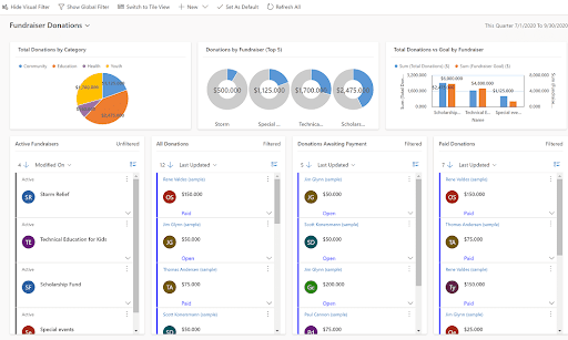
Creating Interactive Dashboards with Filters
Filters into your SharePoint Dashboard increase its interactivity, enabling you to navigate and analyze your data more effectively. Filters allow you to adjust the data displayed on your dashboard based on specific criteria, giving you a more targeted view of your information.
Here is a step-by-step process to create interactive dashboards using filters:
- Select a Web Part to Filter: SharePoint dashboards are composed of multiple ‘web parts,’ each displaying a different data set. Begin by selecting the web part to which you wish to filter.
- Add a Filter Web Part: From the ‘Insert’ tab in the SharePoint Ribbon, select ‘Web Part.’ In the categories list, choose ‘Filter.’ A list of available filter types will be displayed. Select the appropriate filter type for your data and click ‘Add.’
- Connect the Filter to a Web Part: After adding the filter web part, you need to connect it to the web part you wish to filter. In the web part menu, choose ‘Connections,’ then ‘Send Filter Values To,’ and select the web part you wish to filter.
- Configure the Filter: The final step involves configuring the filter according to your requirements. This might involve specifying the column to filter by and defining the filter values.
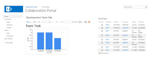
Building Powerful Reports with Report Builder and Embed Code
Microsoft’s Report Builder is a robust tool designed to create insightful, customized reports from data visualized on your SharePoint Dashboard. These reports can be highly interactive and user-friendly, providing valuable insights at a glance.
Here’s how to do it:
- Use Report Builder: Report Builder can be launched directly from your SharePoint site. It provides a Microsoft Office-like authoring environment, which allows you to create tabular, matrix, chart, and free-form reports. You can build these reports using any data source view defined in your SharePoint site.
- Save and Publish the Report: Once your report is ready, save it to the SharePoint library. Doing this makes the report available for viewing in a Web browser.
- Get the Embed Code: Now, navigate to the saved report in your SharePoint library, click the ‘…’ (or ‘More options’) button, and then select ‘Embed Information.’ A dialog box will appear with the Embed Code.
- Embed the Report: Go back to your dashboard edit page. Click on the ‘Insert’ tab in the Ribbon, then select ‘Embed Code.’ Paste the code into the dialog box and click ‘Insert.’
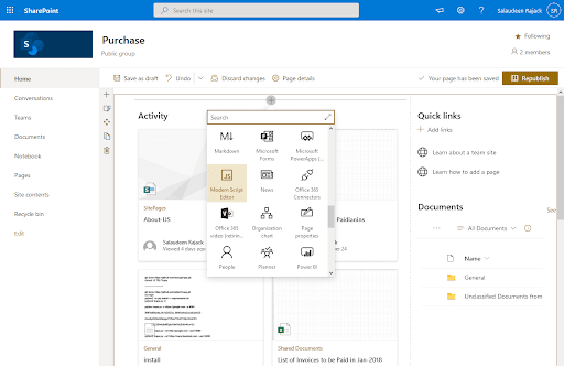
Adding Custom Code to Enhance Your Design
Custom code can provide an elevated level of customization to your SharePoint Dashboard, enabling you to tailor the dashboard’s design and functionality to your specifications. Whether it’s JavaScript, CSS, or HTML, these languages can drastically improve the look and feel of your dashboard.
Here’s how to do it:
- Edit Page: Navigate to your dashboard and click the ‘Edit’ button.
- Add a Script Editor Web Part: Click on the ‘Insert’ tab in the Ribbon, then select ‘Web Part.’ Under the ‘Media and Content’ category, choose ‘Script Editor’ and click ‘Add.’ This will add a Script Editor web part to your dashboard.
- Insert Custom Code: Click the ‘EDIT SNIPPET’ link in the Script Editor web part. A dialog box will appear where you can write or paste your custom code. After you’ve entered your code, click ‘Insert.’
Save Your Changes: Remember to save your changes once you’ve added your custom code.
Why Choose EPC Group For SharePoint Development & Training Services?
Choosing us for your SharePoint Development and Training Services equates to investing in experience, expertise, and a deep understanding of your unique business needs.
With over two decades of proven success in delivering top-tier SharePoint solutions, EPC Group has the breadth of knowledge and technical understanding to guide you through every stage of your SharePoint journey.
From dashboard creation and customization to comprehensive training programs, you are assured of services that surpass industry standards, augment productivity, and empower you to leverage SharePoint’s full potential.
As you consider the future of your data management and collaboration strategies, remember that we stand ready to support you. Contact EPC Group today, and let’s embark on this journey together. Be it SharePoint development or training services; we have a solution tailored just for you.
Fill In The Below Form For – FREE 30 Mins SharePoint Consulting


