
In today’s data-driven environment, Power BI stands out as a leading tool for visualizing and analyzing information. But what sets it apart even further is its robust sharing and collaboration features.
This tutorial will walk you through the complexity of sharing Power BI reports and dashboards, ensuring your team remains on the same page and makes data-driven decisions collectively.
Whether you’re a beginner looking to explore Power BI’s collaborative capabilities or an expert aiming to brush up on the latest features, this guide provides actionable insights to maximize your data storytelling potential.
What is Power BI
Power BI is a data visualization and business intelligence tool developed by Microsoft. It allows users to connect to a wide variety of data sources, transform the data into meaningful insights, and present it through interactive dashboards and reports. Businesses utilize Power BI to make informed decisions by analyzing and visualizing their data in real-time.
Power BI Architecture: Choosing the Right Components for Your Solution
Power BI, Microsoft’s data visualization and analytics tool, offers various components that can be tailored to fit specific business needs. The core architecture includes:
- Power BI Desktop: This is a Windows application primarily used for creating, editing, and publishing reports. It’s the main tool for report designers and data analysts.
- Power BI Service: Often referred to as “Power BI online,” this is a cloud-based service where reports and dashboards created in Power BI Desktop are published, shared, and collaborated upon.
- Power BI Mobile: Offers users access to data and reports on-the-go via mobile devices.
- Power BI Gateway: Acts as a bridge between Power BI online service and on-premises data sources. It ensures data refreshes and maintains up-to-date reports.
- Power BI Embedded: An Azure service that allows developers to embed reports and dashboards into custom applications.
How to connect Power BI to different data sources?
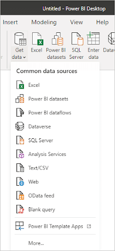
Connecting Power BI to different data sources allows users to import, analyze, and visualize data from various platforms. Here’s how you can connect Power BI to some common data sources:

1. Excel Workbooks:
- Open Power BI Desktop.
- Click on the ‘Home’ tab and then select ‘Get Data’.
- From the pop-up window, select ‘Excel’ and then click ‘Connect’.
- Browse to your Excel file location, select the file, and click ‘Open’.
- Choose the tables or ranges you want to import and click ‘Load’.
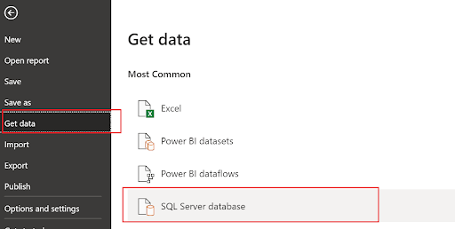
2. SQL Server:
- Click on ‘Get Data’ from the ‘Home’ tab.
- Select ‘SQL Server’ from the options.
- Enter the server name and database name (optional).
- Choose the authentication mode (Windows, Database, etc.) and provide the credentials.
- Click ‘Connect’, and then select the required tables and views.
3. Web Services (Web Content and RESTful APIs):
- Go to ‘Get Data’ > ‘Web’.
- Enter the web URL or RESTful API endpoint.
- Choose the authentication method if required.
- Click ‘OK’. Power BI will retrieve the data and show the navigator window where you can select the required data.
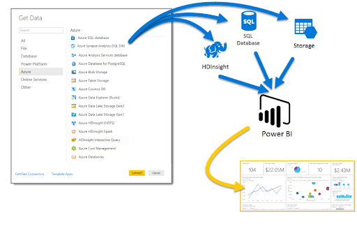
4. Azure SQL Database:
- Click on ‘Get Data’ and select ‘Azure’ > ‘Azure SQL Database’.
- Provide the server name and database details.
- Choose the authentication mode and enter credentials.
- Click ‘Connect’ and select the desired data.
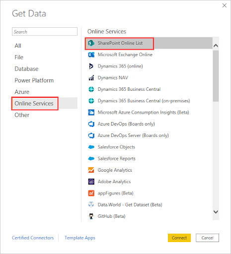
5. SharePoint Lists:
- Go to ‘Get Data’ > ‘More…’ > ‘Online Services’ > ‘SharePoint Online List’.
- Enter the SharePoint site URL.
- Choose the authentication method and provide the required credentials.
- Once connected, select the list or lists you want to import.
6. Other Data Sources:
Power BI supports a plethora of other data sources like Oracle, MySQL, PostgreSQL, Salesforce, and many others.
The general process for each source involves:
- Selecting the desired data source from the ‘Get Data’ option.
- Providing connection details and credentials for the specific platform.
- Choosing the data sets or tables you want to analyze.
How to share and collaborate on Power BI reports and dashboards?
Sharing and collaborating on Power BI reports and dashboards can be achieved in several ways, allowing team members to access, view, and even edit shared content. Here’s a guide on how you can do this:
1. Power BI Service (Power BI Online):
- Share a Dashboard or Report:
- In the Power BI Service, open the dashboard or report you want to share.
- Click on the ‘Share’ button, usually located at the top-right corner.
- Enter the email addresses of the recipients.
- Set the permissions (whether recipients can share with others, whether they can export the data, etc.).
- Click ‘Share’.
- Publish to Web:
- Open the report you want to share.
- Click on ‘File’ > ‘Publish to web’.
- This will generate a public URL that you can share. Note: This method makes the report public, so it’s not recommended for sensitive data.
2. Power BI Workspaces:
- Create a Workspace:
- In the Power BI Service, click on ‘Workspaces’ and then ‘+ Create a workspace’.
- Name the workspace, provide a description (optional), and set up advanced settings as needed.
- Save the workspace.
- Add Members:
- Within the workspace, click on ‘Access’.
- Add email addresses of the people you want to collaborate with.
- Set their roles: Member, Contributor, Viewer, etc., based on what level of access and permissions you want to give.
- Publish Reports to the Workspace:
- From Power BI Desktop, after designing your report, go to ‘File’ > ‘Publish’.
- Choose the workspace you created as the destination.
3. Power BI Embedded:
If you’re developing an application and want to embed Power BI reports within it, you can use the Power BI Embedded service. This requires a more technical setup, involving Azure and Power BI REST APIs.
4. Share via Power BI Mobile:
Reports and dashboards can also be accessed via the Power BI Mobile app. If you’ve shared content with a user, they can view it on their mobile device by logging into the app with their Power BI account.
5. Export and Share:
You can export reports as PDF or PowerPoint (PPTX) files and share them as needed. However, this method provides a static view of the data.
6. Collaborate using Comments:
Users with access to reports and dashboards in the Power BI Service can leave comments on specific visuals. This aids in discussions related to the data being visualized.
Getting Started with Power BI Desktop: Step-by-Step Tutorial
Power BI Desktop, a free application by Microsoft, revolutionizes data visualization and business intelligence. This tutorial offers a step-by-step guide to harness its potential, transforming raw data into insightful reports and compelling dashboards. Dive in and unlock data-driven decision-making for your business.
Step 1: Downloading and Installing Power BI Desktop
Before you can create captivating visuals and insightful reports, you need to have Power BI Desktop installed on your computer. Here’s a straightforward guide to get you started:
- Go to the Official Power BI Website
- Navigate to the official Power BI website at https://powerbi.microsoft.com/.
- Click on the “Download” section in the website’s header.
- Select Power BI Desktop
- Under the “Power BI Desktop” section, click on the “Download Free” button.
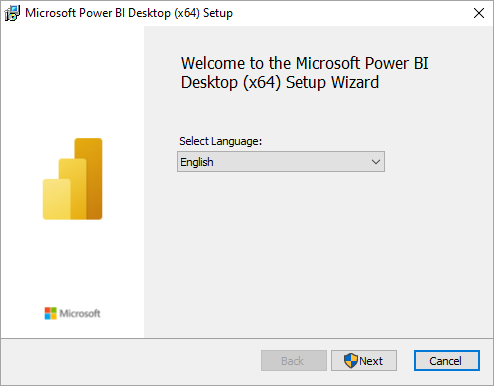
- Start the Installation
- Once the installer is downloaded, locate the .msi file in your downloads folder.
- Double-click on the .msi file to launch the installation wizard.
- Follow the Installation Wizard
- The installation wizard will guide you through several prompts:
- Welcome Screen: Click “Next” to continue.
- License Agreement: Review the terms, accept them, and then click “Next”.
- Destination Folder: Choose where you want Power BI Desktop to be installed. The default location usually suffices for most users. After selecting, click “Next”.
- Ready to Install: The wizard has gathered all the necessary information. Click “Install” to begin the installation process.
- Complete the Installation
- Once the installation is complete, you’ll see a confirmation message. Click “Finish” to exit the installation wizard.
- Launch Power BI Desktop
- You can now find Power BI Desktop in your list of installed programs or search for it in the start menu.
- Launch the application. On the first run, you’ll be greeted with a welcome screen, offering various resources and introductions to the tool.
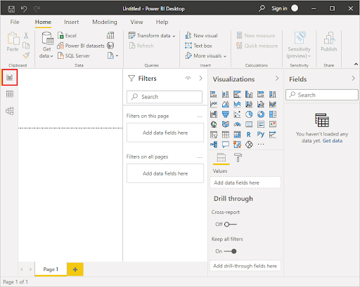
Step 2: Exploring the User Interface and Toolbar
Power BI Desktop has an intuitive, user-friendly interface designed for ease of navigation, even for first-time users. As you begin to familiarize yourself with it, you’ll find creating reports and visuals a breeze. Let’s break down the primary areas of the Power BI Desktop interface:
- The Ribbon
At the top, similar to other Microsoft Office products, there’s the Ribbon. It’s organized into tabs, each dedicated to a set of related functions:
- Home: Contains basic options like ‘Get Data’, ‘Enter Data’, and ‘Manage Queries’.
- View: Allows toggling between different views like ‘Data’, ‘Model’, and ‘Report’, and manages the grid, page layout, and themes.
- Insert: Used to add new visuals, text boxes, images, and more to your report.
- Modeling: Offers tools for managing relationships, creating new tables or columns, and defining measures.
- Format: Used to adjust the appearance of the selected visual or report element.
- The Canvas
This is the main area in the center of the screen where you’ll design your reports. You can drag and drop visuals, resize them, and arrange them as desired.
- Fields Pane
Located on the right side:
- Fields: Lists all tables, columns, and measures in your data model. Here, you drag and drop fields onto your canvas or visuals to create and define reports.
- Values: Where you drag numerical data to be analyzed.
- Axis: Used for categorical data.
- Legend, Color, and Details: Allow further customization of the data visuals.
- Visualizations Pane
Still on the right, but with a separate tab from Fields:
- Contains various visual types like bar charts, line charts, pie charts, and more advanced visuals. By clicking on a type, it’s added to the canvas.
- Pages Tab
Located at the bottom. It allows you to manage multiple pages in your report, akin to slides in a PowerPoint presentation.
- Filters Pane
Situated on the right:
- You can apply page level, visual level, or report level filters to refine what data gets displayed.
- Data and Model Views
Accessible via icons at the left sidebar:
- Data View: Here, you can see a table view of your data, make transformations, or create calculated columns.
- Model View: Provides a high-level view of your data model, where you can see and manage relationships between tables.
Step 3: Connecting to Internal Data Sources
Power BI Desktop offers a rich set of connectors, allowing users to pull in data from various sources. This step focuses on connecting to internal data sources like Excel spreadsheets, SQL Server databases, and more.
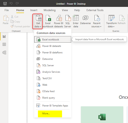
- Connect to Excel
- Click on ‘Home’ in the Ribbon.
- Select ‘Get Data’.
- In the pop-up window, choose ‘Excel’ and click ‘Connect’.
- Browse to your Excel file location, select the file, and click ‘Open’.
- A Navigator window will appear, showing available tables and ranges. Select the ones you wish to import and click ‘Load’.
- Connect to SQL Server
- In the ‘Home’ tab, select ‘Get Data’.
- From the options, choose ‘SQL Server’.
- Enter the server name and, optionally, the database name.
- Choose the authentication type (Windows, Database, etc.) and input the credentials.
- Click ‘Connect’, and in the Navigator window, select the required tables or views, then ‘Load’.
- Accessing CSV or Text Files
- Under the ‘Home’ tab, click ‘Get Data’.
- Choose ‘Text/CSV’ from the options.
- Navigate to your file location, select the file, and click ‘Open’.
- Review the data in the preview window, make any adjustments if necessary, and then click ‘Load’.
- Connect to Access Database
- Click on ‘Get Data’ from the ‘Home’ tab.
- Select ‘Database’ and then choose ‘Access database’.
- Browse to your database file, select it, and click ‘Open’.
- In the Navigator window, pick the tables or queries you want to use and then click ‘Load’.
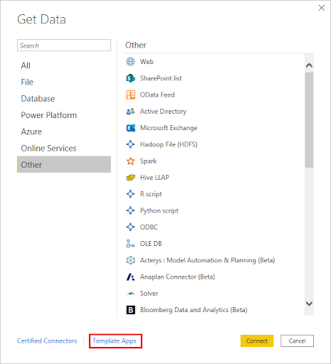
- Connect to SharePoint Lists (On-Premises)
- Go to ‘Get Data’ > ‘More…’ > ‘Online Services’ > ‘SharePoint List’.
- Enter the SharePoint site URL.
- Provide the required authentication details.
- Once connected, select the desired list and load it.
- Advanced Data Connections
Power BI supports various other internal sources such as:
- Analysis Services: For direct connection to an existing SSAS model.
- Web: Connect to data available over the web through URLs or web services.
- Other Databases: Like Oracle, MySQL, and more.
Step 4: Connecting to External Data Sources
Power BI Desktop is not limited to internal or on-premises data; it can seamlessly connect to various external cloud-based platforms and services. This connectivity amplifies its strength as a robust data visualization tool, granting access to a plethora of external datasets.
- Connect to Azure SQL Database
- Go to the ‘Home’ tab and click ‘Get Data’.
- Choose ‘Azure’ from the options and select ‘Azure SQL Database’.
- Enter the server details and database information.
- Choose the desired authentication method, provide credentials, and click ‘Connect’.
- In the Navigator window, select the data you wish to import and then click ‘Load’.
- Connect to Dynamics 365 (Online)
- Click ‘Get Data’ > ‘Online Services’ > ‘Dynamics 365 (online)’.
- Provide the Dynamics 365 URL.
- Select the authentication method, typically OAuth, and log in.
- Pick the desired tables or entities from the Navigator and load them.
- Accessing Google Analytics
- Under ‘Get Data’, go to ‘Online Services’ and choose ‘Google Analytics’.
- Authenticate using your Google account credentials.
- Once connected, you’ll see a list of available metrics and dimensions. Select the ones you want and click ‘Load’.
- Connect to Salesforce
- In ‘Get Data’, navigate to ‘Online Services’ and select ‘Salesforce Objects’ or ‘Salesforce Reports’.
- Input your Salesforce URL (often the default is fine for most users).
- Authenticate using your Salesforce credentials.
- Browse through available objects or reports, select the ones you need, and load them into Power BI.
- Connect to SharePoint Online Lists
- Go to ‘Get Data’ > ‘More…’ > ‘Online Services’ > ‘SharePoint Online List’.
- Enter the SharePoint Online site URL.
- Authenticate, usually with OAuth, and grant permissions.
- Once connected, select the desired online list and load it.
- Other Cloud Services
Power BI offers connectors for many other cloud platforms such as:
- Amazon Redshift
- Snowflake
- Azure Blob Storage
- Azure Data Lake
- Azure HDInsight, and many others.
How to import data into Power BI?
Importing data into Power BI is a foundational step in creating reports and visuals. Power BI provides a broad range of connectors to fetch data from various sources. Here’s a concise guide on how to import data into Power BI:
- Launch Power BI Desktop
Open the Power BI Desktop application on your computer.
- Click ‘Get Data’
- Locate the ‘Get Data’ option, usually found in the ‘Home’ tab on the Ribbon.
- Choose Data Source
Power BI offers connectors for multiple data sources:
- Files: Connect to common file formats such as Excel, CSV, XML, and more.
- Database: Use this option to connect to databases like SQL Server, Oracle, MySQL, and others.
- Power Platform: Allows connections to platforms like Power BI datasets and Power Apps.
- Azure: For accessing Azure-based data services like Azure SQL Database, Azure Blob Storage, etc.
- Online Services: Connect to cloud platforms such as SharePoint Online, Dynamics 365, Google Analytics, and more.
- Other: This category includes additional sources like Web (via URLs or web services), ODBC connections, and more.
- Configure Connection Settings
Once you select a data source:
- Provide necessary connection details. For instance, if connecting to a database, you’d input the server name, database name, and authentication credentials.
- Depending on the source, you may also have advanced options to optimize data import, set up native queries, or customize other settings.
- Navigate and Select Data
After connecting:
- You’ll often see a ‘Navigator’ window that displays available tables, sheets, views, or other relevant data structures.
- Select the items you wish to import. For more refined selection, you can preview data and choose specific columns or rows.
- For some sources, you’ll also have the option to either ‘Load’ data directly into Power BI or ‘Edit’ it using the Power Query Editor for transformations and cleaning before import.
- Load Data
Click the ‘Load’ button to bring the data into Power BI. The data will be available in the ‘Data’ view, and you can begin building your data model and visuals.
How to Effectively Use Visualization Tools in Power BI Desktop for Data Analysis
Visualization tools in Power BI Desktop offer a dynamic approach to data interpretation, making complex datasets both comprehensible and actionable. By leveraging these tools, users can transform raw numbers into insightful charts, graphs, and dashboards.
Effectively using these visuals not only enhances decision-making but also narrates compelling data stories, making the essence of analytics accessible to a broader audience. Let’s delve into the best practices for using these visualization tools in Power BI for optimal data analysis.
Creating Pie Charts and Bar Charts
Both pie charts and bar charts are fundamental visualization tools in Power BI that convey data points in easily digestible formats. When used correctly, they can reveal patterns, relationships, and comparisons within your data.
Pie Charts
Pie charts represent categorical data as slices of a circle, where each slice’s size is proportional to its corresponding data value.
- Steps to Create:
- Select the data you want to represent.
- Click on the ‘Pie Chart’ icon in the ‘Visualizations’ pane.
- Drag the desired field to the ‘Values’ area and the categorical data to the ‘Categories’ area.
- Best Practices:
- Use pie charts for a small number of categories; typically, 5-7 is optimal.
- Avoid using pie charts for data that’s essential to compare accurately; human eyes can struggle to compare the size of segments.
- Use a consistent color scheme and avoid overly vibrant colors.
Bar Charts
Bar charts use rectangular bars to represent data, with the length of the bar corresponding to its data value. They can be oriented horizontally or vertically.
- Steps to Create:
- Select the data set you want to visualize.
- Click on the ‘Bar Chart’ icon in the ‘Visualizations’ pane. Choose between clustered, stacked, or 100% stacked formats.
- Drag your categorical data to the ‘Axis’ or ‘Category’ section and the data values to the ‘Values’ section.
- Best Practices:
- Use horizontal bar charts when dealing with longer category names.
- For datasets with a wide range of values or when you want to show part-to-whole relationships, consider using stacked bar charts.
- Keep a uniform color scheme for better clarity. However, if you want to highlight a specific bar, you can use a contrasting color.
Using Conditional Formatting for Enhanced Visualizations
Conditional formatting is a powerful feature in Power BI that lets you visualize data by changing the appearance of cells, rows, or columns based on specific conditions. It can highlight particular values, identify ranges, or even pinpoint trends, making your reports more dynamic and insightful.
1. Font Color Scaling
This changes the text color based on the value.
Steps to Apply:
- Click on the desired visualization.
- Under the ‘Format’ section in the ‘Visualizations’ pane, find and expand the ‘Conditional formatting’ option.
- Select ‘Font color scales’. Define the lowest, middle, and highest values’ colors. Power BI will interpolate between these colors based on your data.
2. Background Color Scaling
This alters the background color of a cell or field based on its value.
Steps to Apply:
- Select your visualization.
- Navigate to ‘Conditional formatting’ > ‘Background color scales’.
- Specify colors for minimum, midpoint, and maximum values.
3. Data Bars
Data bars offer a simple bar visualization within a cell, proportional to the value it represents.
Steps to Apply:
- Choose your visualization.
- Under ‘Conditional formatting’, pick ‘Data bars’. Adjust the direction and color as needed.
4. Color by Rules
This allows you to set distinct colors for specific data values or ranges.
Steps to Apply:
- Click on your visualization.
- Navigate to ‘Conditional formatting’ > ‘Color by rules’.
- Define the rules by setting value ranges or conditions and assigning colors for each.
5. Icon Sets
Introduce icons (like upward or downward arrows) based on the value or trend direction.
Steps to Apply:
- Select the visualization.
- Go to ‘Conditional formatting’ > ‘Icon sets’.
- Choose your desired icon set and set conditions for when each icon should appear.
6. Field Value Formatting
Alter the appearance of a specific field based on its value.
Steps to Apply:
- Pick the visualization containing the field.
- Under ‘Conditional formatting’, choose ‘Field value’.
- Set conditions and formatting rules for the selected field.
Creating Interactive Reports with Power View
Power View, initially a feature in Excel, found its way into Power BI, providing users with the capability to create ad-hoc, interactive dashboards and reports. These reports help visualize and interact with data in a more intuitive way, making data storytelling effective.
- Activating Power View:
- Power View is built into Power BI Desktop, so there’s no need for separate activation. However, if you’re using Excel, ensure you have the Power View add-in enabled.
- Adding a Power View Report:
- In Power BI Desktop, once you have your data model ready, click on a blank report page.
- Just like adding any other visualization, select the fields you want to include in your Power View report from the ‘Fields’ pane.
- Designing the Layout:
- Use the ‘Visualizations’ pane to add different visuals like charts, maps, cards, and tables to your report.
- Arrange and resize visuals to design a layout that tells your data story logically and intuitively.
- Creating Tiles:
- Tiles act as containers for visuals, and the data inside them can be switched by interacting with a tile navigator.
- Drag a field into the ‘Tile by’ option under visualization properties. This will create a navigable tile for each value in that field.
- Applying Filters:
- Use the filter pane to add report, page, or visual level filters to your Power View report.
- Interactivity is enhanced when users can modify the data they’re viewing using slicers or direct filtering.
- Using Hierarchies for Drill-Down:
- If you have defined hierarchies in your data model, you can use them in Power View to drill up or down through levels by simply clicking on the visual.
- Highlighting and Cross-filtering:
- Selecting a data point on one visual will automatically highlight related data on other visuals. This allows users to see relationships and patterns effortlessly.
- Adding Multimedia:
- Integrate images from your dataset into your Power View report for richer context. For example, product images in a sales report or employee photos in a HR dashboard.
How to share and collaborate on Power BI dashboards?
Sharing and collaborating on Power BI dashboards is crucial for making data-driven decisions collectively within a team or organization. Power BI provides various methods to share and collaborate on reports and dashboards. Here’s how you can effectively do this:
- Publish to Power BI Service:
Before sharing, you need to publish your Power BI Desktop (.pbix) reports to the Power BI Service (cloud platform).
- Save your Power BI Desktop report.
- Click on the Publish button in Power BI Desktop.
- Choose the appropriate workspace in the Power BI Service to publish your report.
- Share a Dashboard or Report:
Once your report is on Power BI Service:
- Go to the desired report or dashboard in the Power BI Service.
- Click on the Share button at the top right.
- Enter the email addresses of the individuals or groups you want to share with.
- Add an optional message and configure sharing settings (like whether recipients can share with others).
- Click Share.
- Use Workspaces:
Workspaces are a way to group content:
- Create a new workspace from the Power BI Service.
- Add members to the workspace and set their permissions (Member, Contributor, Viewer, etc.).
- Publish reports and dashboards to this workspace. All members will have access based on their permission level.
- Embed in SharePoint Online:
If your organization uses SharePoint Online:
- Go to your desired report in Power BI Service.
- Click on File and select Embed in SharePoint Online. This generates a link.
- Go to your SharePoint Online page, add the Power BI web part, and paste the link.
- Embed in Microsoft Teams:
With Teams integration:
- In your Microsoft Teams channel, click on the + (add a tab) button.
- Choose the Power BI option.
- Select the report or dashboard you want to add to the channel.
- Distribute with Power BI Apps:
Power BI apps are a collection of dashboards, reports, and datasets:
- Package your dashboards and reports into a Power BI app.
- Publish the app to the Power BI Service.
- Share the app with users, who can install and view it.
- Commenting and Annotating:
For collaborative discussions:
- In Power BI Service, click on a report or dashboard visual.
- Use the commenting feature to start a conversation about a specific visual. Team members can reply, making it a collaborative discussion.
- Row-Level Security (RLS):
If you want to share data but need to restrict certain data access:
- Implement RLS in Power BI Desktop by defining roles and rules.
- After publishing to the Power BI Service, assign users to roles. They’ll only see data allowed by their role’s rules.
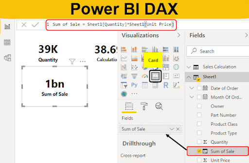
Power BI DAX functions
Data Analysis Expressions (DAX) is a formula language specifically for data analysis and reporting in Power BI, Analysis Services, and Power Pivot in Excel. DAX functions are used to create custom calculations in Power Pivot tables and Power BI Desktop data models.
Here’s an overview of some key DAX functions and their applications:
- Time Intelligence Functions:
These are critical for financial and sales reporting which often requires Year-To-Date, Month-To-Date, and other time-based aggregations.
- CALENDAR(start_date, end_date): Returns a table with a single column of dates between the start date and end date.
- DATEDIFF(start_date, end_date, interval): Returns the count of interval boundaries between two dates.
- TOTALYTD(expression, dates): Calculates the year to date for the specified dates.
- Aggregation Functions:
Similar to Excel’s aggregation functions, but designed for use in data models.
- SUM(column_name): Totals up the numbers in a column.
- AVERAGE(column_name): Returns the average of a column.
- COUNT(column_name): Counts the number of rows of data.
- Filter Functions:
Used to return specific data types, like a table or value, based on set conditions.
- ALL(table_name): Removes filters from a table, effectively showing all data.
- FILTER(table_name, expression): Returns a table that has been filtered by a specific condition.
- RELATED(table_name): Returns a related value from another table.
- Information Functions:
Provide data about the data model or values within it.
- ISBLANK(value): Checks if a value is blank.
- RELATEDTABLE(table_name): Returns a related table.
- USERNAME(): Returns the domain username of the person accessing the data.
- Text Functions:
For manipulating and creating string-based results.
- CONCATENATEX(table, expression, delimiter): Joins two or more strings into one.
- FORMAT(value, format_type): Converts a number or date into a formatted string.
- UPPER(text): Converts all letters in a text string to uppercase.
- Logical Functions:
For creating conditional results.
- IF(condition, result_if_true, [result_if_false]): Returns one value if a condition is true and another if false.
- AND(condition1, condition2): Returns TRUE if both conditions are TRUE.
- OR(condition1, condition2): Returns TRUE if either of the conditions is TRUE.
- Parent & Child Functions:
Useful for hierarchically structured data.
- PATH(item, parent_column): Returns a delimited text string with identifiers of all parents for the current row.
- PATHLENGTH(path): Returns the number of levels in a hierarchy.
- Table Functions:
To manipulate tables.
- ADDCOLUMNS(table, name, expression): Returns a table with new columns specified by the DAX expression.
- SUMMARIZE(table, group_by_column, name, expression): Creates a summary table based on set columns and aggregations.
Take Your Data Analysis Skills to the Next Level with EPC Group’s Power BI Training
Elevate your data-driven decision-making capabilities with Our Power BI Training! In today’s competitive landscape, possessing advanced data analysis skills is more than just a value-add; it’s a necessity. With our comprehensive training program, delve deep into the intricacies of Power BI, Microsoft’s industry-leading data visualization tool. Whether you’re a beginner aiming to grasp the basics or a seasoned professional eyeing advanced functionalities, our tailored modules cater to every learning curve.
Witness real-world scenarios through interactive sessions, hands-on projects, and in-depth case studies. Our seasoned trainers, equipped with vast industry experience, ensure that you are not just learning but mastering the tool. As data becomes the heartbeat of industries, stand out in the crowd with unparalleled insights and analytical proficiency.
Don’t just stay ahead; lead the curve. Join EPC Group’s Power BI Training and transform your data narratives into powerful stories. Enroll today and supercharge your data analysis journey!
Frequently Asked Question
What Power BI is used for?
Power BI is a Microsoft tool used for visualizing and analyzing data from various sources, enabling data-driven decisions through interactive reports and dashboards. It simplifies data sharing and provides insights for businesses.
Is Power BI better than Excel?
Power BI and Excel serve different purposes. While Excel excels at data manipulation and basic analysis, Power BI is tailored for advanced data visualization, analytics, and sharing interactive reports. Both tools complement each other in data tasks.
What’s a Power BI business user?
A Power BI business user utilizes Power BI to view reports, dashboards, and interact with data visualizations but typically doesn’t create or manage datasets. They leverage insights to make informed business decisions.
What’s the difference between Power BI Pro and Power BI Premium?
Power BI Pro allows individual users to create, view, and share reports. Power BI Premium provides advanced features, larger data capacities, and on-premises reporting, catering to organizations needing dedicated resources and enhanced performance.