
One of the many features that make Power BI stand out is “Conditional Formatting.” This feature empowers users to bring their data to life by setting visual rules that adjust the format of cells, rows, columns, and visuals based on the data’s content. In this guide, we will dive into how to use Conditional Formatting in Power BI to accentuate, differentiate, and prioritize data, thereby enhancing overall data visualization.
Power BI includes a feature called “conditional formatting” that enhances visual components based on certain conditions. This article will explain how conditional formatting works and how it can turn your data into great stories. You’ll learn how to highlight key insights, identify patterns, and bring your reports to life. Let’s get started!
What is Power BI?
Power BI is a data visualization and business intelligence tool developed by Microsoft. It enables users to connect to a wide range of data sources, transform raw data into meaningful insights, and present them in interactive dashboards and reports. With a user-friendly interface, Power BI allows both analysts and non-analysts to create compelling visualizations. It’s available in desktop, cloud-based, and mobile versions, catering to different needs. Power BI is integral for businesses aiming to make informed decisions based on their data analytics.
What is Conditional Formatting?
Conditional formatting is a feature in Power BI that allows you to turn data visualizations into engaging stories. As a visual enhancer, it allows you to automatically change the appearance of your visuals according to established guidelines.
It helps you to draw attention to important data points, trends, and outliers by modifying color changes, font changes, and data bars. Conditional formatting helps in storytelling by increasing the impact of your reports and directing your audience’s attention to the most important aspects of your data.
Benefits of Conditional Formatting in Power BI
When you incorporate conditional formatting into your Power BI toolkit, you gain many benefits that expand your understanding of data visualization to new heights. Here are some benefits:
| Benefit | Description |
| Visual Emphasis | Highlights important data points, making them stand out from the rest. This ensures that critical information isn’t overlooked. |
| Data Trends Recognition | Helps in quickly identifying patterns, outliers, or anomalies in data, as trends can be color-coded or visualized with data bars. |
| Enhanced Data Interpretation | Colors, gradients, or data bars can simplify complex data, making it more digestible and easily interpretable even for non-data professionals. |
| Better Decision Making | By spotlighting crucial insights, users can make informed decisions swiftly. |
| Interactive Reporting | Conditional formatting makes reports dynamic. As data changes, the formatting will adjust automatically, offering a live and interactive data experience. |
| Efficient Data Analysis | Reduces the time spent on data analysis, as visual cues guide users straight to the most relevant parts of a report. |
| Customization | Allows for tailored visualization experiences based on specific business needs or audience preferences. |
| Enhanced Aesthetics | Improves the overall look of the reports, making them more professional and engaging. |
| Improved Data Categorization | Groups and categories can be defined by specific colors or formats, streamlining data categorization and segment analysis. |
| Clarity in Aggregated Values | Totals and subtotals can be formatted differently, providing clear distinctions between detailed data and aggregated values. |
How to Apply Conditional Formatting in Power BI
As mentioned before, conditional formatting is a powerful feature that gives you life to give your Power BI graphs. We’ll look at several technical instances, each showing a different way of using conditional formatting to turn your data visualizations into compelling narratives.
Color by Rules
Applying conditional formatting using the ‘Color by Rules’ option in Power BI allows you to specify colors for data points based on certain conditions. This makes it easier to visually distinguish between different data values. Here’s a step-by-step guide:
- Select the Visual: Click on the visual (e.g., table, matrix, or chart) to which you want to apply conditional formatting.
- Access Conditional Formatting: From the visualizations pane, navigate to the “Format” section. You’ll find a paint roller icon representing this section.
- Choose ‘Conditional Formatting’: Expand the dropdown and you will see multiple options like ‘Data bars’, ‘Font color’, ‘Background color’, etc. For this guide, we are focusing on ‘Color by rules’.
- Define Your Rules:
- Click on ‘Color by rules’.
- In the dialog box, you can set up rules based on values or expressions.
- For example, if you’re formatting a sales column, you can set:
- If sales are > 10,000, color = green.
- If sales are between 5,000 and 10,000, color = yellow.
- If sales are < 5,000, color = red.
- Apply Formatting: Once you’ve defined your rules, click ‘OK’. The colors in your visual will change based on the rules you’ve set up.
- Adjust as Needed: You can always revisit the ‘Color by rules’ option to tweak or add more rules as your data or requirements change.
- Review: Check the visual to ensure that the formatting has been applied correctly and that it provides the desired emphasis to your data points.
Color by Values
Using the ‘Color by Values’ option in Power BI, you can apply colors to data points based on their actual values, typically using a gradient where the color intensity corresponds to the magnitude of the data. This is particularly useful for spotting trends, outliers, or specific ranges within a data set. Here’s a step-by-step guide:
- Select the Visual: Begin by clicking on the visual (e.g., table, matrix, or chart) where you wish to apply the conditional formatting.
- Access Conditional Formatting: From the visualizations pane, navigate to the “Format” section, denoted by the paint roller icon.
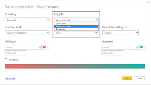
- Choose ‘Conditional Formatting’: Within the dropdown, you will find various options. For this tutorial, we’ll focus on ‘Color scale’.
- Define the Gradient Settings:
- Click on ‘Color scale’.
- A dialog box will appear, allowing you to specify the minimum, midpoint, and maximum data values along with their corresponding colors.
- For example:
- For the minimum value (e.g., lowest sales), you can set a color like light blue.
- For the midpoint value (e.g., average sales), a medium shade like blue might be suitable.
- For the maximum value (e.g., highest sales), you can choose a darker shade like navy blue.
- You can also define the type (number, percentile, etc.) and value for these points.
- Apply Formatting: After configuring your gradient settings, click ‘OK’. The colors in your visual will then adjust according to the data values and the gradient you’ve defined.
- Adjust if Necessary: If you need to refine the gradient or make other adjustments, you can return to the ‘Color scale’ option.
- Review: Ensure that the applied formatting offers a clear and effective representation of your data’s value distribution.
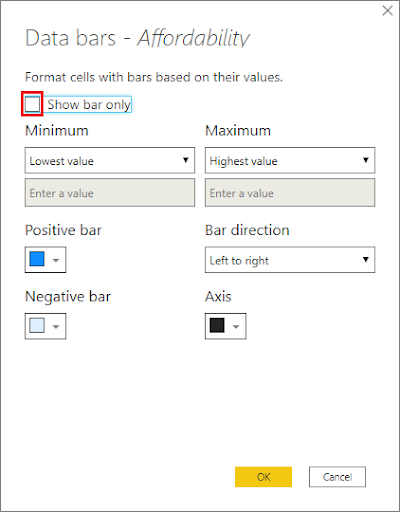
Data Bars
Data bars in Power BI are graphical representations within table or matrix cells that indicate the magnitude of values in a range, similar to a bar chart within a cell. They’re excellent for quickly spotting larger or smaller values in a column. Here’s how you can add data bars to your visuals:
- Select the Visual: Start by clicking on the visual (like a table or matrix) where you want the data bars.
- Navigate to Conditional Formatting: In the visualizations pane, find the “Format” section, which is signified by the paint roller icon.
- Opt for ‘Conditional Formatting’: Within the dropdown menu, you’ll find the ‘Data bars’ option.
- Configure Data Bar Settings:
- After clicking on ‘Data bars’, a dialog box will appear.
- You’ll be prompted to set the minimum and maximum values for your data range. Power BI will automatically set these based on your data, but you can adjust them as needed.
- Choose the direction (left-to-right or right-to-left) for the data bars.
- Specify colors for the bars. You can pick different colors for positive and negative values, especially useful if you’re working with datasets that have both.
- Apply the Formatting: Once you’ve made your selections, click ‘OK’. The cells in your visual will then display data bars corresponding to the value magnitude.
- Make Adjustments if Needed: If the data bars don’t quite look right or if you need to represent the data differently, simply return to the ‘Data bars’ option to modify your choices.
- Review and Analyze: With the data bars in place, you can easily identify larger or smaller values in your dataset. It’s a graphical way of representing data magnitude without leaving the confines of a table or matrix.
Formatting Totals and Subtotals
Formatting totals and subtotals differently from regular data values in Power BI can help them stand out, making reports more readable and comprehensive. Here’s how to apply conditional formatting specifically to totals and subtotals in your visuals:
- Select the Visual: Click on the table or matrix visual where you wish to format the totals and subtotals.
- Navigate to the Format Pane: In the visualizations pane, go to the “Format” section, signified by the paint roller icon.
- Adjust Total and Subtotal Settings:
- Locate the ‘Subtotals’ or ‘Totals’ section, depending on which you wish to format.
- Turn on the ‘Subtotals’ or ‘Totals’ option if they aren’t already displayed.
- Apply Conditional Formatting:
- Go back to the main Format menu.
- Click on ‘Conditional Formatting’ to reveal the dropdown menu.
- Choose the formatting option you want (like ‘Font color’, ‘Background color’, ‘Data bars’, etc.).
- When the dialog box opens, you can now set conditions specifically targeting totals of subtotals. This might involve selecting a particular color or style different from the main data.
- Set Distinct Styles:
- Given that totals and subtotals are aggregations, it’s advisable to pick styles that make them distinct. For example, you could use a bold font, a darker background color, or a thicker data bar.
- Apply the Formatting: Once you’re satisfied with your conditional formatting rules, click ‘OK’. The totals and subtotals in your visual should now be formatted differently from the rest of the data.
- Review and Refine: Scan through your visual to ensure that the formatting on the totals and subtotals stands out as desired. If needed, make adjustments to perfect the visual representation.
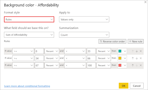
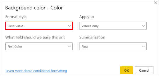
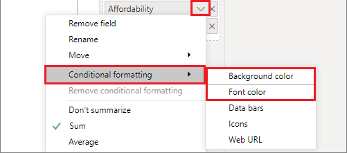
Format Background or Font Color
Customizing the background or font color conditionally can provide depth to your Power BI visuals, helping to spotlight certain data points or provide a clearer understanding of data ranges. Let’s delve into how to achieve this:
- Select the Visual: Begin by clicking on the visual (e.g., table, matrix) where you want to apply the conditional formatting.
- Access the Format Pane: In the visualizations pane, move to the “Format” section, represented by the paint roller icon.
- Opt for ‘Conditional Formatting’: Expand this dropdown, and you’ll see options like ‘Font color’ and ‘Background color’.
- Choose Desired Formatting Option: Depending on whether you want to change the font or the background, select the appropriate option.
- Define Rules or Gradient:
- For ‘Font color’ or ‘Background color’ based on rules:
- Click on ‘Color by rules’.
- Define the conditions under which certain colors will be applied. For instance:
- If sales are > 10,000, font color = white and background color = green.
- If sales are < 5,000, font color = black and background color = red.
- For ‘Font color’ or ‘Background color’ based on values:
- Click on ‘Color scale’.
- Define a gradient (e.g., from light blue for lower values to dark blue for higher values).
- Apply Formatting: After setting your preferences, click ‘OK’. Your chosen visual will now reflect the conditional formatting rules or gradients you’ve defined.
- Adjust as Needed: If you need to modify the colors or conditions, you can always return to the ‘Font color’ or ‘Background color’ option under ‘Conditional Formatting’ and make the necessary adjustments.
- Review: Ensure that the applied colors enhance data readability and provide a clear understanding of the data’s distribution or significance.
Navigating Common Challenges in Conditional Formatting
Power BI’s conditional formatting is valuable but has a few potential pitfalls. This section will provide helpful information to help you overcome these pitfalls and find workable solutions.
- Issue: Inconsistent formatting across all visuals
- Solution: Create a formatting theme that assures uniform design throughout your report to keep a consistent appearance. You can ensure your graphics have a unified and polished appearance by specifying color palettes, font selections, and other formatting components in a theme.
- Issue: Formatting doesn’t apply as expected
- Solution: Verify your conditional formatting rules. Ensure that all conditions are properly defined, and all logical expressions are written properly. Additionally, ensure you’ve chosen the appropriate visual components for formatting and review your formatting options step by step to find any errors.
- Issue: Conflicts caused by overlapping formatting
- Solution: Set the formatting rules in order of importance to avoid conflicts. To ensure that competing circumstances are resolved in the desired order, alter the order in which your rules are applied. This helps you obtain the desired appearance by preventing accidental rule overrides.
- Issue: It doesn’t update instantly
- Solution: Check to see that the data in your report is properly refreshed if conditional formatting modifications take longer than expected. Make sure your report is updating at the correct frequency and that your data source connections are current. A simple refresh can occasionally solve formatting problems.
- Issue: Applying formatting to an incorrect data range
- Solution: When specifying your formatting rules, be specific. Verify that your conditions refer to the relevant data columns or measurements. To obtain the required formatting result, ensure the rule precisely addresses the intended range.
- Issue: Slow report performance brought on by conditional formatting
Solution: Report performance that may be impacted by complicated conditional formatting. Limiting the number of rules or conditions you use, especially for large datasets, is a good idea. Check to see if any specific formatting requirements must be met, and then revise your rules to balance presentation and functionality.
EPC Group Expertise Unlocking the Full Power of Power BI
With years of experience and a profound understanding of data analytics, we stand at the forefront of Power BI solutions. We don’t just help organizations visualize data; we empower them to unlock the latent potential within their data, fostering a culture of informed decision-making and strategic foresight.
Our team of seasoned professionals dives deep into the intricacies of your business processes, tailoring Power BI solutions that resonate with your specific needs. From integrating diverse data sources to applying advanced conditional formatting, we ensure your visuals are not only insightful but also engaging.
Isn’t it time your organization transcended traditional data visualization? Embrace the future. Unlock the full power of Power BI with EPC Group.
Dive deeper into what Power BI can offer your business. Reach out to EPC Group today and redefine your data visualization journey!